Netflix is planning to launch its first redesign in over four years, with the changes coming in under one month's time. The redesign is meant to reflect the streaming giant that Netflix has become. This new update will ditch the slow moving carousels which present rows of movies, as though you were browsing in a video store. In their place will be a much more immersive home screen that feels like an app.
While Netflix won't disclose any true numbers, it's believed that the streaming service currently holds over 60 million subscribers worldwide. Most of them use the streaming service as opposed to the DVD mail-ins, with most users going directly to the site to watch their preferred content. They usually stay at the website for the duration of their viewing time. With the current carousels, you can peruse the movies in any given genre, and click on the poster image thumbnail to start instantly downloading content. That will soon change, with a mid-June launch of a new browsing feature that allows users to stay on the homepage. Netflix's lead product designer Navin Prasad explains:
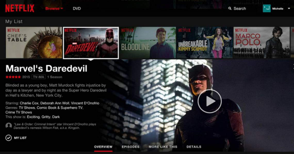
"If you look at the current Netflix site it feels like disparate web pages. You click on one thing, go to another page, then you have to back out. On the new one we really want to display all the information in one line, so it's all very app-like, like Gmail."
The new site will bring up a menu once you click on a thumbnail, where you will see an image of the content, a brief synopsis, and a menu bar with tabs labeled 'Overview, Episodes, More like this, and Details'. The new site will make the user's experience feel more like channel surfing. The background color is also changing from white to black, so that it feels and looks less like Amazon and more like a darkened theater. The current carousel scroll, which many believe is too slow, will be replaced with clickable arrows that slide 5 titles at a time into place. About the new design, Navin Prasad continues:
"Everything is an opportunity to tailor the content shown to you. The design has to be able to accommodate a horror movie and make a horror movie look scary, make a documentary look thought provoking, and the comedy really funny. And we do that through the imagery."
What do you think of these new changes coming this June? Do you like what you hear? Or is change to hard to accept with something as already as user friendly as Netflix? You can take a look at the new redesign here:
